Data
This series of graphs will show a number of insights from the data collected ranging from type of websites visited to trends of carbon footprint produced each day.
Introduction
The information from the data collected has been recorded over a timespan of 7 days. Variables such as date visited, website and energy type as well as carbon footprint generated have been included. In order to generate the data for carbon footprint, I have kept track of my history and tested them through a website carbon generator that will provide me with the necessary data. With this, the datasets are hence illustrated through these 4 graphs to show the different insights.
Data Visualisation
Bar graphs are mostly used to illustrate information such as types of websites visited and total carbon footprint per day. Pie charts are used to show the breakdown of energy type that the website I visited has used. Lastly, a control chart is created to show the highest and lowest carbon footprint produced.
Findings
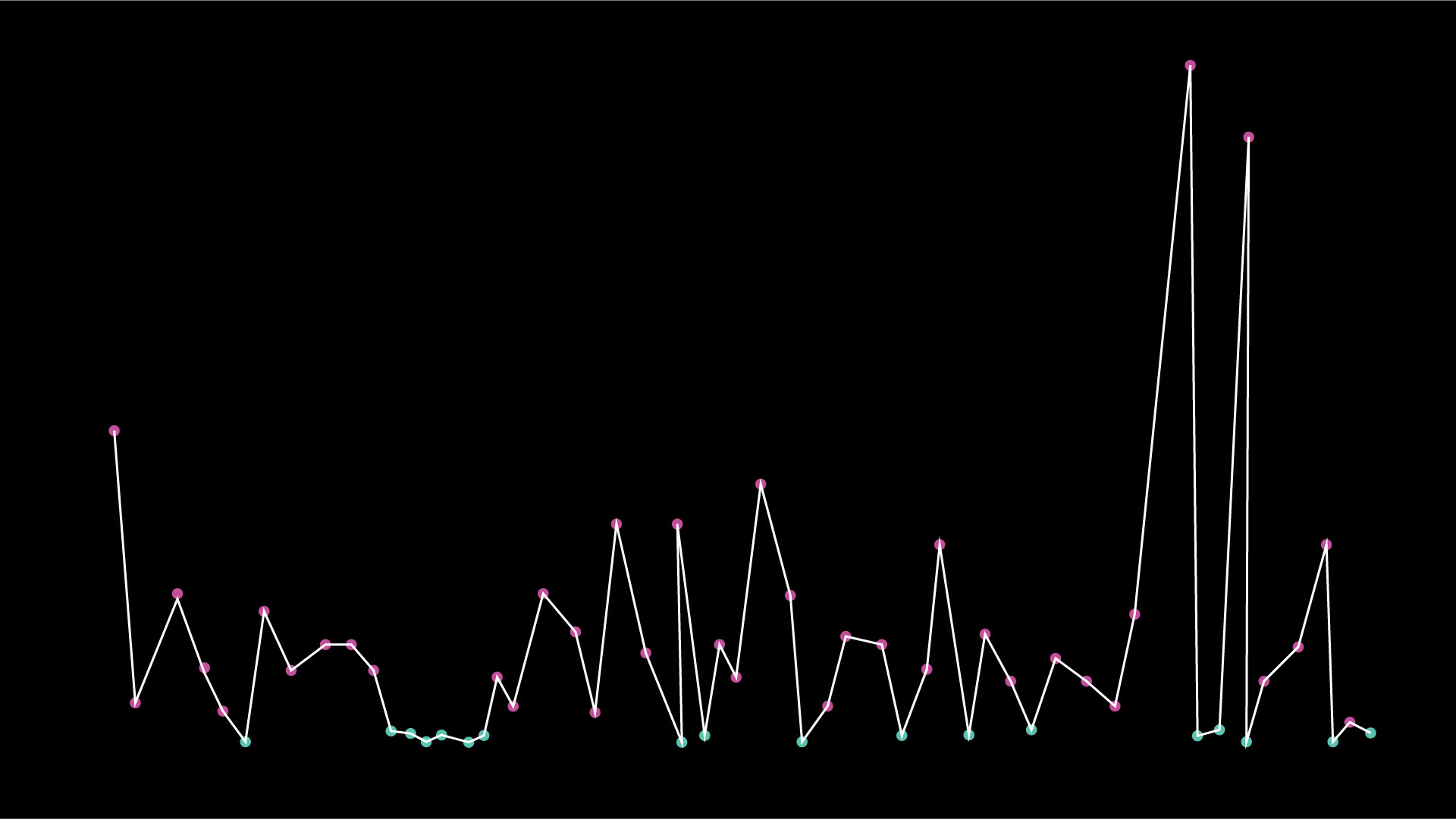
From the control chart, we can infer that by comparing the average grams a website produces, the majority of the websites use more than the average. The highest carbon footprint produced is recorded at 23.39g while the lowest, 0.09g. The points are coded in a pink and green, representing the energy type as well.
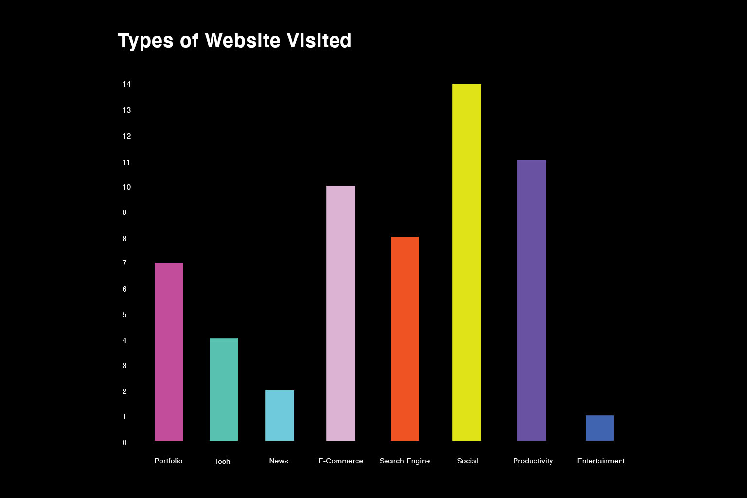
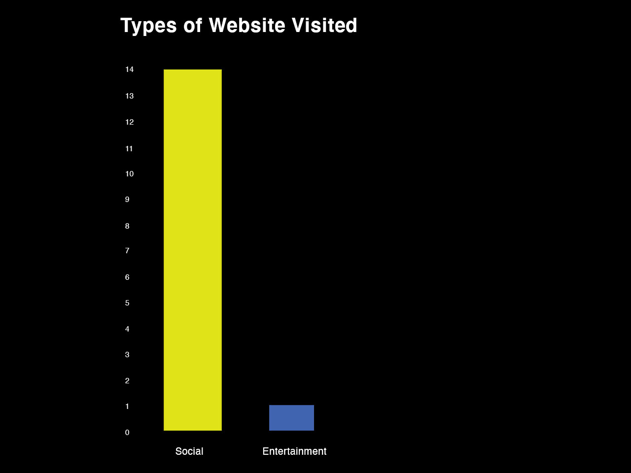
As we further unpack our dataset, we can find the types of websites visited. These websites are categorized and organized with a general grouping label such as social and e-commerce. As shown in the graph, social was recorded the highest at 14 while entertainment was at 1.
Insights
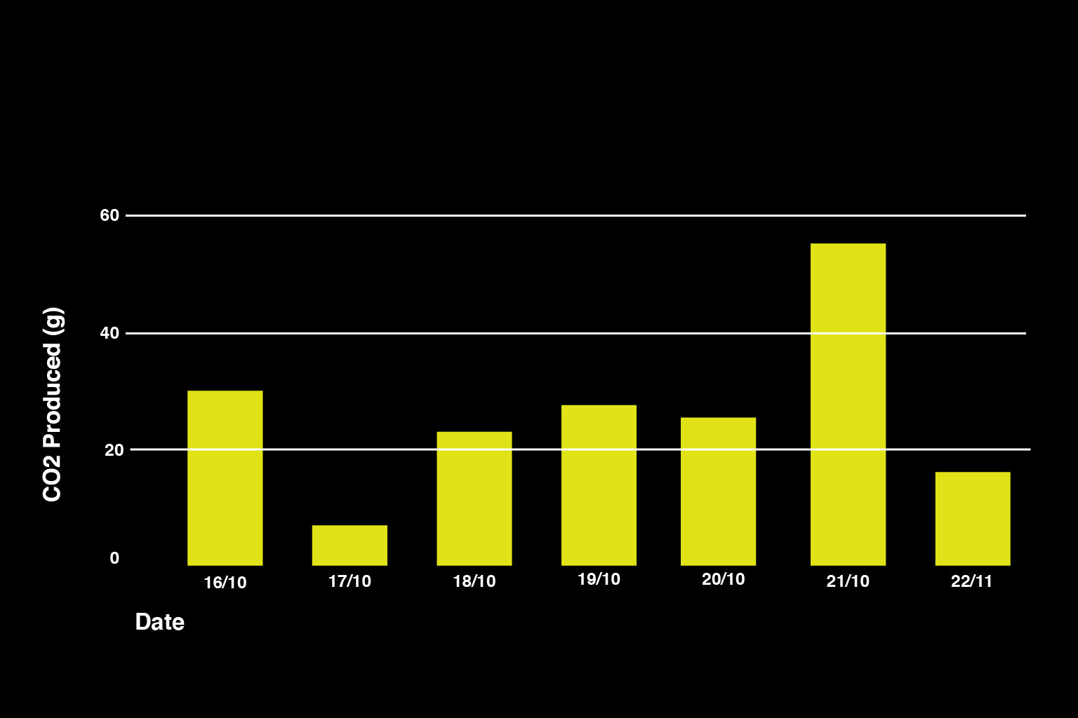
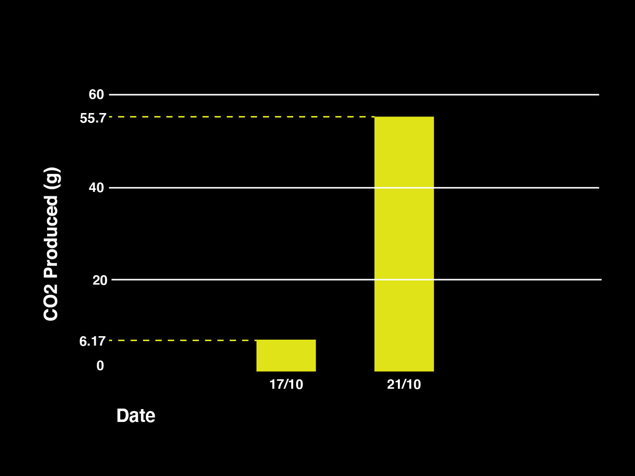
The second bar graph shows the total amount of carbon footprint emission per day. From the graph, it can be seen that the highest amount is recorded on Saturday while the lowest is on a Tuesday.
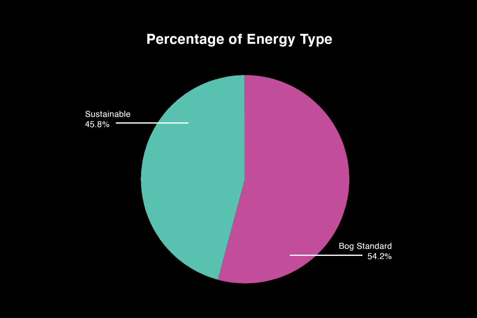
Next would be the pie chart that shows a percentage breakdown of the type of energy used. The results do not show a stark contrast compared to the previous graphs as the breakdown can be almost split in half. However, bog standard energy still makes up the majority of the pie chart (54.2%) while sustainable makes up the rest (45.8%). The energy types that are considered as sustainable generally use green hosting which uses renewable energy.
Conclusion
Based on the graphs, most of the websites I have visited are generating more than the average of the amount of carbon footprint (1.76g). The impact it has on our environment also worsens as more than half are running on bog standard. As I looked into the dataset for what websites are generating the most, it is usually attributed to websites that have a lot of information and files that are stored. For example, Adobe Fonts is recorded at one of the highest but the result lines up as it stores a lot of files for the user to download. However, even though search engines such as Google records at the lowest of 0.09 and are sustainable, we still have to factor in the millions of users using this search engine. As a one week cycle, the data recorded should serve as an accurate representation of my Internet usage habits.
References
- Wholegrain Digital. Website Carbon Calculator. www.websitecarbon.com
